ShopDreamUp AI ArtDreamUp
Deviation Actions


Description
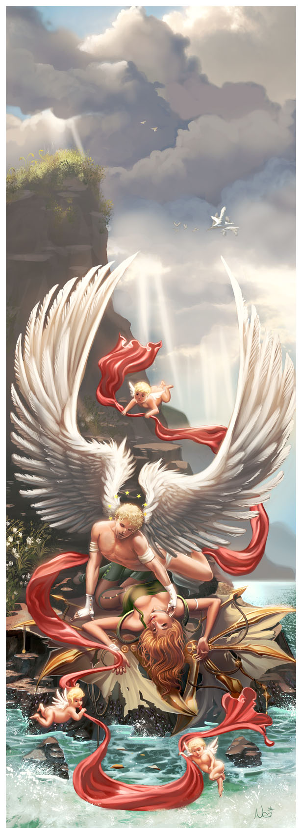
she does nothing but dream,
dream a little very day
die a little every day
for she cannot ever have what she dreams for.
one day she's foolish, takes a chance
tries to make her dreams come true
she feels the sun on her face
the wind in her hair
brushing by her so swiftly
her body falls but her soul is flying.
this is a personal piece, personal to me in a few small ways, nothing major. we all wish we could fly, but few of us are foolish enough to pursue those dreams. this is in no way supposed to be a interpretation or the Icarus tale.
i set out to try and outpaint myself. a few of you guys have been saying well, this piece is your best yet or that one is, yet every single one was drawn by somebody else. it was driving me nuts!
i gave this piece my all, lots of ref used but not in the places you'd expect, made sure i took my time and spent plenty on it too.
the idea of the long canvas here is to guide the eye down, especially here on dA where it requires you to scroll down, my intentions were that you get a sense of how far she fell.
about 15 and a half hours total
original dimensions 3750 x 10350 pixels 300 dpi
submitted for the bring your vision to life contest
Image size
616x1700px 228.97 KB
© 2009 - 2024 WhiteHowler7
Comments251
Join the community to add your comment. Already a deviant? Log In
Nei,
An artist tries to achieve something in there piece whether it be realism, storytelling, mood, etc and I worry because that intent isn't always known. So I'm not sure where you would like the critique to be focused on so I'm just going to go broad.
Overall I like the classical approach as it really takes me back to the Renaissance. It has a lot of the elements of that period, the cherubs, the flowing garments, the lighting, and drama of the story. You've pulled it off magnificently; a very valiant attempt.
The areas that that I pick up are just a few. While I can make out the two geese at the tip of the angelic males wing I'm not sure what else is there behind the front goose that tends to make that spot awkward.
I read the other critique about impact and your responses and I think I can appreciate both sides. To my eye, what might help the impact an support your thoughts on how far she has fallen would be to have a person looking down over the side of the cliff. That would add a good level of depth by scale, give a sense of direction, visually move your eye down and possibly add to the horror of the failed attempt.
The hips, hindquarters and legs of the cherub in the left hand side look a bit off but that may just be due to the darker lighting on the cheek farthest from the viewer.
The right hand ring finger of the fallen lady looks a bit long and tends to get lost, making it look like she has only four fingers.
Finally, the male's pectorals look awkward. The left pectoral looks stretched and starts to flow under the arm. I'm still learning that particular region of the chest and arm and struggle with it, but I do believe the pectoral connects to the shoulder.
I have no problems at all with the wing direction of the male. I certainly reinforces the heavenly imagery shooting upwards to the clouds as if to throw in the idea of a positive, but I'm curious how different the story or theme might be if the wings were curved downward as if in sorrow. What impact would that have on the viewer. Just something to think about is all.
Finally, to contrast the feathered wings with her spikey, bat-like wings is typical anymore (for this type of contrast), but it still has its place. I might have liked to seen even more mechanical aspects to her flying gear. Just as something else to consider.
And that's really it for the issue areas for me. I think your technique is incredible and your nature rendering skills are impeccable. You obviously know what you want and can certainly achieve them. This is definitely a piece to be proud of. Well done.
One more thought before closing. You comment, "the idea of the long canvas here is to guide the eye down, especially here on dA where it requires you to scroll down, my intentions were that you get a sense of how far she fell."
I think that scrolling down really does this piece an injustice and affects the overall impact. Obviously not something you can necessarily control but don't rely on that to support your story when it really does the opposite. This piece really needs to be and should be seen in its entirety to appreciate it fully.